Core principles for stable visuals
- Give background visuals, informational overlays, and lyric layers distinct roles
- Avoid stacking too many strong elements at once
- Reduce background contrast slightly when text needs to be readable
- Let color temperature and motion match the genre mood
- Build atmosphere across multiple tracks instead of resetting everything every song
- Keep crushed whites and blacks rare — they clash with venue lighting
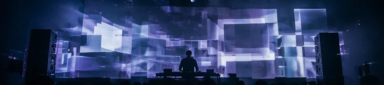
Three-layer design
Automated VJ visuals break into three layers: background, informational, and lyric. Deciding the role of each layer first prevents the "everything competing" look that makes venues tired.
Principle 1: background is atmosphere, not message — abstract patterns and genre-matched color only. Principle 2: informational layer is memory — let Now Playing and DJ names appear briefly, not permanently. Principle 3: lyric layer is emphasis — never on by default; released only for drops and singalong moments.
How to treat lyrics
Lyrics are powerful because they pull audience attention quickly. That makes them effective, but also easy to overuse.
Decide whether lyrics are a featured moment or a persistent support layer. That choice helps them coexist with the rest of the visual system.
AUTOVJCLUB ships four lyric modes — Shatter, Flood, Liquid, Stack. Pick based on tempo, language, and whether the moment is a peak or a background support.
Informational overlays should suggest, not dominate
Now Playing, DJ names, and event labels do not always need to be large and persistent. Often they work better as brief, intentional accents.
Automated VJ is not only about showing more information. It is also about shaping the room without exhausting the eye. Now Playing that "happens to be there when you notice it" tends to stick better than a persistent banner.
Genre-to-color cheat sheet
- House / Techno
- Cool blues and purples. Moderate contrast and smooth motion. Slow oscillations tend to lock with the groove better than hard strobes.
- Hip Hop / R&B
- Warm oranges and reds with a larger share of black for depth. Keep text as accent, not headline.
- Pop / J-pop / Anime
- Saturated, multi-hue palettes. Pairs well with lyric layers — but keep full intensity rare, or the night becomes exhausting.
- Ambient / Lounge
- Low contrast, low saturation, slow movement. Informational layers should be minimal; atmosphere is the main character.